[El Capitán]
En me promenant sur BGG, je suis tombé sur CA
Quelqu’un sait quelque chose sur ce jeu ?
Ben voilà,
C’est un bon Kramer (Tycoon à l’origine) et nous allons profiter d’une coédition avec QWG (encore eux ![]() pour le sortir en France avec les graphismes de Mike Doyle (ce qui est une large amélioration par rapport à l’original) et des règles plus tendues…
pour le sortir en France avec les graphismes de Mike Doyle (ce qui est une large amélioration par rapport à l’original) et des règles plus tendues…
Prévu pour Octobre 2007.
Toujours d’actualité ?
Ca je ne sais pas, je ne fait qu’assurer la partie française avec encore moins d’implication que pour les PdF. Disons que QWG fait pour le mieux…
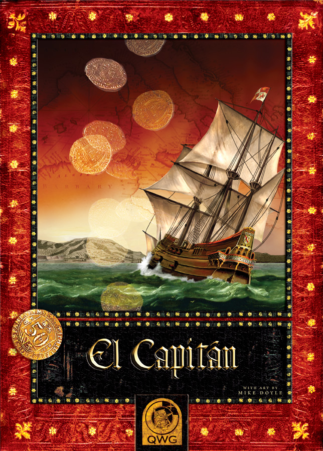
In the last entry, I had highlighted an exciting new project that I have been working on with QWG which I’d like to expand on. The name is El Capitán and – as the pictures suggest – takes place in the Mediterranean Sea in the 16th century involving Spanish, Italian and Portuguese powers. Basically, it is a colonization/money-making game at it’s heart. …with, yes some pirate activity. It’s not a pirate game, but in some cases pirates are in play. The designer is one of the big ones that everyone will be familiar with, though I cannot mention his or her name now.
As I understand, the game is to be released Oct 2007 in the following countries (so far): Netherlands, Belgium, Luxembourg, Germany, USA, Canada, Australia, New Zealand, UK/Ireland, Finland, Sweden, Denmark, Norway. Maybe also in Poland, France, Italy and Spain. This is all I know in terms of distribution.
Pictured above, we have the QWG Master Print Series box. Also seen here is how it looks as part of the MP system. The whole experience is becoming very rich and textural. I’m very excited to see this product added to the collection and how the series is fleshing out as a brand identity for QWG.
There will be some nice special touches in the game art, which I’m very pleased with as well. I’ll be releasing more images next month.
Some have been interested in the creative process. So I’ll elaborate on that a bit.
Generally, in these productions, the games are still being tested, fine tuned and finalized. So the safest bet for the artist is to start on the cover. Given the theme has been fleshed out by the time an artist is called on, everything is ready for me to begin here. The cover is also an effective piece for the announcement of a game, so it is no surprise that this is usually the first piece completed.
For this production, I had proposed a few covers which I sketched out. First sketches vary depending on the project. Sometimes it is a rough photo collage to give a sense of composition, color and subject. Other times, I simply find a pool of scrap art that can serve as a guide for subject and style. I’ll say, “Imagine if it looked like this but with some of the elements of the other picture.” And then other times I might actually sketch a rough black and white image or paint a rough picture. Much of this depends on how complicated an image is to draw and how comfortable I am doing it quickly or what can be found to assist in the visualization process. In this case, the publisher was happy with the cover and picked one to move forward with. Incidentally, the alternate cover that did not make it became the starting player piece as seen below.

From here, it was just a matter of redrawing the image and refining to what you see above. From the beginning, I also create a graphic look and style to the box in terms of where the title goes and how it all fits together. So, the first sketches are not only image but graphic design. I find I have an advantage being a graphic designer by trade as the image is married to the format from the beginning. Generally, a game illustrator will create an image with a clear space or generic art hole in the picture (like clouds or bushes or such) where the title tucks in. I tend to believe this is why most covers look alike as they have been developed with a standard assumption of how and where a title should be placed. The look is “locked in” by virtue of the illustration which is built to house the graphic design. Given that I had previously worked on a special format for QWG, initial sketches had to take into account how the image would live in their Master Print Series box look as well as live within another format for their partner publisher’s boxes. The two of which need to look great, but different in company identity, but the same in terms of product identity.
In contrast to the box top, the bottom of the box is the last piece to be developed. It is generally low priority as it does not effect anything at all (component inventory, how they come together on a sheet or fit and work with a board) and is dependent on a product image. I generally like taking the photo of the product which I either comp up or receive as a prototype. In the case of the QWG MP Series, I have established a tradition of setting a poem, quote or interesting fact on the sides of the box bottom. It is just a nice touch that I’ve not seen before and adds to the narrative in an unusual but authentic way.
In following posts, I’ll speak more toward board and component development.
Hope you enjoy,
Mike Doyle

Il y en a qui ont testé el capitan… ?
C’est qu’il n’y a pas beaucoup d’avis dessus (tycoon)
Beau et bon jeu de majorité.
Une partie faite au salon. Le plateau est très joli, les cartes aussi, mais la lisibilité n’est pas des meilleures. J’étais “à l’envers” du plateau et ça n’a pas été simple.
Pour ce qui est du jeu. On voyage grace aux cartes, on prend possessions des lieux moyennant finance, on s’endète souvent pour pouvoir être compétitif sur les majorités, et on décompte en fin de manche. C’est pas très original mais ça tourne très bien. Disons que je mettrais 3/5 si j’avais à le noter sur cette unique partie.
Mais j’y rejouerai volontier
je dirais un pur jeu de majorité! La première partie risque d’être longue (+ de 2 heures, hier une partie qu’avec des débutant à même duré 3 heures) Mais je pense qu’avec l’expérience ça tombe radicalement. Sinon, bcp d’interaction, très bien servi par une superbe édition. Par contre il y a un seuil : si un joueur arrive à être dans les points en prenant 1 emprunt de moins que les autres, n’esperez plus le revoir ! Mais plus qu’un défaut , ça cré une tension supplémentaire selon moi.
Voila un jeu qui resortira souvent à mon assoc je pense.
3 heures pour un jeu qui est donné pour 90 min…!!
Ce jeu me fait envi, je le mettrais bien sur la liste du père noël.
100% d’accord avec Drax, le joueur qui a un emprunt de moins, aïe aië.
J’oubliais, l’intensité augmente avec les manches : autant, la première a peu d’intéret, autant la dernière est terrible !
Il faisait aussi potentiellement partie de ma liste pour le Père Noël, mais après ma partie d’Essen, ce n’est plus le cas.
C’est clair que les illustrations sont vraiment jolies (il faut juste ne pas être assis du mauvais côté du plateau, sinon on a du mal à lire le nom des villes). En plus les mécanismes collent plutôt bien au thème.
Par contre je n’ai vraiment pas aimé. C’est un jeu capitaliste. Plus tu as d’argent, plus tu en gagnes, et moins tu en as, plus tu es obligé de t’endetter auprès de la banque (tu n’as pas le choix, même si parfois ça ne t’apporte rien du tout, au contraire). Une fois qu’un joueur est lancé il est difficile à rattraper.
Bon tout ça c’est après qu’une seule partie, donc c’est quand même à prendre avec des pincettes.
Très beau jeu, je l’ai acheté pour Doyle, les autres (caylus, yspahan… )me convenant pas ou moins. Deux parties avec mon gamin et envie d’ y revenir à plus: bon achat.
S’agit-il, à l’instar de son compère de collection Demetra, d’une série en tirage limitée ?
Les retour mon pas l’air super super… ça l’air d’un bon jeu sans plus…
Qu’est ce que vous en pensez ?
J’attend de faire ma première partie. Je me pose des questions sur la lisibilité du jeu, problème ayant été énoncé plusieurs fois par certains joueurs.
Le plateau sous les yeux, je m’interroge vraiment en quoi il y a un problème de lisibilité. A priori le hic serait la difficulté de localiser les différentes ville sur le plateau. Mais même si le nom des villes peut être difficile à lire compte tenu de la police employée, un diagramme sur chaque carte rappelle la position exacte sur le plateau de façon on ne peut plus claire.
Franchement, j’aimerais des précisions!
Tu veux dire que tu veux un éclaircissement sur le manque de clarté supposé ?
jetseb dit:Les retour mon pas l'air super super... ça l'air d'un bon jeu sans plus...
Qu'est ce que vous en pensez ?
Oui voila, bon jeu mais encore un jeu de majorité. Il y en a beaucoup, celui là te fera t'il tilt ? Moi pas, même si je le trouve agréable à jouer. Je ne l'ai pas acheté même si je lui reconnais des qualités.
Pour ce qui est de la lisibilité, c'est pareil, si on a quelque chose a reprocher à ce jeu, c'est ça. C'est certe très joli mais on peut avoir des réserves. Maintenant, avec 2-3 parties dans les pattes, on retient les villes, ça ne doit pas poser plus de problème que ça.
pour la lisibilit, j’ai trouvé que le petit dessin sur la carte indiquant les 2 villes parmi les 9 était très lisible même de loin et me suffisait.